With so much information available today, many people are
simply overwhelmed by the data. This is
important for us to remember when we are designing reports and
visualizations. We need to help our users
understand the story we are telling and one way to do this is to draw their
attention to the important information.
The eyes go directly to change and difference, so conditional
formatting is a great way to make data stand out. However conditional formatting in Power BI
can produce some pretty ugly results. In
this article, I am going to show some tips to help use conditional formatting
to focus on key numbers of the report.
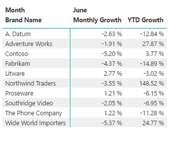
I will start with a simple matrix report that shows the monthly
and yearly sales growth by brand. In
this case we only have 10 brands, but you will notice nothing really jumps out
to you. As a consumer of this report you
must read through each row.
 So let’s go to the format tab on the visualization pane and turn
on conditional formatting.
- Click the format icon
- Expand conditional formatting
- Choose the measure to format
- Choose the formatting option (background, font
color and/or data bars)
- Switch the option to On
- (Optional) Repeat with other measures
In my example I have turned on the Background for both
measures and below you will see the results.
At this point, this is not the most appealing report. The colors are a little overwhelming and the
data-ink ratio is very high on the ink side.
So how do we clean this up and help the consumer focus on the story we
are telling?
First let’s look at what Power BI did by default.
Let’s go back to the visualization pane, formatting tab and
choose Advanced Controls under Backgrounds.
This will open the Background color scales window (shown above). In looking at this window you will see that
Power BI setup a color scale with Red for the lowest value scaling to Green for
the highest value. With this approach
only one value is Red and one value is Green, the remaining values are a
combination of Red and Green. This results in a very colorful report, that can be difficult to interpret.
However, you can make some simple changes in this window to
clean up all the color. You will notice
the Minimum and Maximum fields are drop down lists. The other option is Number. In my example I want to focus on the brands
that have negative growth, so the consumer of the report can quickly identify
the brands that need attention.
 To do this, I am going to make a few changes to the
Background color scales.
- Change Minimum and Maximum to Number
- Set the Minimum and Maximum number to 0
- Change the color for Maximum to White
I make those changes for both measure and now the report
does not have as much color and my attention is drawn right to the brands with
negative growth. Of course you could
make the Minimum color white and Maximum color green to focus on the positive
growth.
This is just one example of how you could use Conditional
Formatting. You could follow similar
steps to format font colors and you can also use data bars to help focus the user’s
attention. I will explain more about
data bars in a future article.


.jpeg)
Comments
Post a Comment