Posts

Showing posts from April, 2020

Using Full Page Apps in Dynamics 365 Finance

Image
Have you ever wanted to put a website or a model-driven Power App in one of your existing Dynamics 365 Finance workspaces or forms?  You might already know you can create a new workspace with a website, but did you know you can add the website to an existing workspace? Here is an example of the Vendor invoice entry workspace with the Invoice Capture Power App embedded. Prior to using this feature, you need to turn on "Saved views support for workspaces" in feature management. Once this feature is enabled you can follow the following steps to add the Invoice Capture app or any model-driven Power App or website to an existing workspace. Open the vendor invoice entry workspace From Options - choose Personalize this page From personalize menu - select the 3 dots - and then Add an app Once that is selected (the screen goes gray) - click on the section header where you want to add the app (in my example I put it in Links) On the Add an app menu - choose Website Give it a name (my e

Covid Dashboard - Article 6 - Creating a group for a slicer

Image
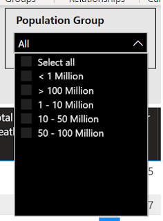
I will continue to build on my earlier posts about my  COVID19 Dashboard .    In this series, I have written a few different blog articles describing not only how I built it, but some things I learned in the process. The current list of topics include: Working with growing CSV files Using index and merge when transforming data Using time functions to calculate the daily change Reporting based on the population Working with maps, setting data types correctly Today I am going to look at a question one person asked me.  When they were using the dashboard, they wanted to be able to filter the global results by countries of similar size. After thinking about this for a while, I decided on the following approach.  There are probably different approaches that can be used, and that is one of the things I really like about Power BI.  In this case, I tried to take a very simple approach. Step 1 - I had to decide how I wanted to group the countries.   I took a look at

COVID 19 Dashboard – Article 5 – Working with maps

Image
I will continue to build on my earlier posts about my  COVID19 Dashboard .    In this series, I am writing a few different blog articles describing not only how I built it, but some things I learned in the process. The current list of planned topics include: Working with growing CSV files Using index and merge when transforming data Using time functions to calculate the daily change Reporting based on the population Working with maps, setting data types correctly Possibly more to come depending on how long this all goes…. PART 5 – Working with maps I will be the first to admit, I have not used the mapping features in Power BI very often.   I have used them for some simple demos, but being an accountant, I am more often interested in the numbers versus the visual location.   However, when analyzing a global pandemic, I felt a map visual or two might be important. So without going to any custom visuals, there are four map visualizations in Power BI.   Map Fille

COVID 19 Dashboard – Article 4 – Reporting based on population

Image
I will continue to build on my earlier posts about my  COVID19 Dashboard .    In this series, I am writing a few different blog articles describing not only how I built it, but some things I learned in the process. The current list of planned topics include: Working with growing CSV files Using index and merge when transforming data Using time functions to calculate the daily change Reporting based on the population Working with maps, setting data types correctly Possibly more to come depending on how long this all goes…. PART 4 - Reporting based on population In looking at the data, I quickly realized simply looking at total numbers or even daily changes was only giving me a limited view of what was happening.     Were the large number of cases in New York simply because they have more people than most other states, or were they growing at a different rate.   Are New York citizens at a higher risk of acquiring the virus than California citizens.   It became evident

COVID 19 Dashboard - Article 3 - Adding some key measures - unique time functions

Image
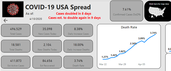
I will continue to build on my earlier posts about my COVID19 Dashboard .   In this series, I am writing a few different blog articles describing not only how I built it, but some things I learned in the process. The current list of planned topics include: Working with growing CSV files Using index and merge when transforming data Using time functions to calculate the daily change Reporting based on the population Working with maps, setting data types correctly Possibly more to come depending on how long this all goes…. PART 3 – Adding some key measures In my earlier posts, I spent time explaining where I acquired the data and some key steps I took in transforming the data into the data model.   In this post, I will explain some of the DAX I used to create some of the key measures for the visualizations.   One of the first steps in design is to identify what questions you are trying to answer or the story you are trying to tell with your visualizations and reports.

COVID 19 Dashboard – Article 2 - Transforming the Data – Calculating between rows in Power Query

Image
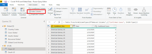
I will continue to build on my earlier posts about my COVID19 Dashboard .   In this series, I am writing a few different blog articles describing not only how I built it, but some things I learned in the process. The current list of planned topics include:   Working with growing CSV files   Using index and merge when transforming data   Using time functions to calculate the daily change   Reporting based on the population   Working with maps, setting data types correctly   Possibly more to come depending on how long this all goes…. PART 2 – Continuing to transform the data In my first post, I explained how I brought in data from a CSV file and used “Unpivot Columns” to transform the data into a format that works much better for reporting.   Once the data was in this format, I quickly noticed that the values (Cases, Deaths and Recoveries) were cumulative.   In other words, these amounts were ending balances not daily transactions, if I look at it as an accountant.