Posts

Showing posts with the label Power BI

Business Analytics and Visualization

Image
It has been a while since I posted a blog article.  Things have been busy and unfortunately my blog has suffered.  Not only have I been busy working in the Microsoft Dynamics 365 and Power Platform arena, but I have also been teaching at a local university.  This past semester I taught Business Analytics and Visualization.  It was a fun course to teach and I was able to introduce business students to the power of analytics using both Power BI and Tableau.  The text for the course was Introduction to Business Analytics, 1 st Edition by Vernon Richardson & Marci Watson.  The text did a great job of covering the types of analytics and the mindset and approach you should follow as a business analyst.  I recently used some of this material in a presentation at an FPnA conference, and it was well received, so I thought I would put the thoughts together here for everyone to read. In today's data-driven world, the ability to transform raw data into meanin...

Creating a date table with a fiscal year in your Power BI data model

Image
There are many different articles available on Time Intelligence in Power BI.   Many new users to Power BI do not really understand the importance of having a date table in their data model.   I have spoken on this topic on many different occasions and continue to receive a lot of questions about the topic.   In this article I am going to try and cover a few tips on how to work with dates in your Power BI model. Many new users simply use the Auto Date & Time function of Power BI.   This function automatically creates a hidden date table for each field in the model with a date or date/time data type.   This function is enabled by default and it allows for slicing by Year, Quarter, Month and Day.   The problem with Auto Date and Time is that it only works with a standard calendar (Jan to Dec).   It requires a datetime column in the fact table.   It does not work with multiple fact tables and it does not support time intelligence calculatio...

An easy way to create backgrounds for Power BI

Image
Trying to make your Power BI reports look nice can sometimes be a struggle.  Do you put a box around a visual?  What about shading in the background?  Maybe you want a header or some lines to break up the page.  Well you can certainly create boxes, lines and shading all within Power BI, but they become objects that people might click on and they are hard to line up and keep from moving, so there must be a better way. One feature in Power BI is the support for background images. When I first saw this option, I thought it was more for putting a watermark behind the report. However once I did some research and played with it, I discovered that I could really use it to create a great page layout. Now first thing to keep in mind, I am an accountant and not a graphic designer, so I need an easy way to create.the.backgrounds. That is where another Power product comes in. No not PowerApps, but PowerPoint. Wait, PowerPoint is for creating slide shows, not gra...

USERELATIONSHIP in DAX

Image
A common problem many users face it the fact that there are multiple date fields in their tables, and when they want to use a date dimension, Power BI only allows for on active relationship between the two tables. For example, I have a dimension table from my leasing software that included information on each lease including the commencement date of the lease and the expiration date of the lease.   In Power BI when I use a separate date dimension (which I always recommend for many different reasons), I can only link the dimension table to date table with one active relationship.    See screen shot below. Since most of my visualizations will be based on the Commencement Date, I will make that the active relationship.   However, I would like to create a visualization showing my leases by expiration date.   In order to do this, I have a couple options. 1.        I could create a second date dimension table in my...

Join Your Power BI Peers at the 2018 Power BI World Tour

Image
The Power BI World Tour is back for 2018! I am excited to be participating again this year. Join your local SMEs, MVPs, and peers at these value packed two-day events in eight cities between August and November. Registration is open – secure your seat today! Whether you are local to the area, traveling from near or faraway, the Power BI World Tour will provide exclusive learning and networking opportunities. Don't miss the opportunity to get involved in one or more of these amazing event locations: Melbourne | Sydney | Charlotte | Copenhagen | Seattle | Dubai | Montreal | Dallas Boost your expertise and company operations for years to come. Each location will feature a General Session presentation by Microsoft and 24+ breakout sessions across 3 learning tracks designed for the Power BI Analyst, Developer/IT Administrator, and New Professional. One attendee last year raved, “the different speakers provided great and varied content. [I] loved the di...

Showing the last 12 months based on a date slicer

Image
When working with financial and sales data, clients often ask for charts showing the last 12 months of data.  This is actually very simple using relative date filtering. In addition, they might ask to compare to the same month last year.  With a simple DAX calculation (SAMEPERIODLASTYEAR) it is possible to add this measure. Here is the formula: Same Month Last Year = CALCULATE(Sum(Sales[SalesAmount]),SAMEPERIODLASTYEAR('Date'[Datekey])) For many users this is all they need.  The chart will update each month and they will always be able to see the last 12 months.   However, this chart will not work with date slicers.   If the client adds a date slicer to the page and selects just one month, the chart will be limited to one month. The reason the chart is limited to one month is because the date dimension relates to the sales fact table and it filters the data for the selected month. Howe...

Making the important numbers stand out

Image
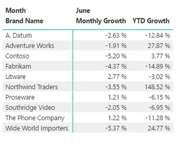
With so much information available today, many people are simply overwhelmed by the data.  This is important for us to remember when we are designing reports and visualizations.  We need to help our users understand the story we are telling and one way to do this is to draw their attention to the important information. The eyes go directly to change and difference, so conditional formatting is a great way to make data stand out.  However conditional formatting in Power BI can produce some pretty ugly results.  In this article, I am going to show some tips to help use conditional formatting to focus on key numbers of the report. I will start with a simple matrix report that shows the monthly and yearly sales growth by brand.  In this case we only have 10 brands, but you will notice nothing really jumps out to you.  As a consumer of this report you must read through each row. So let’s go to the format tab on the visualization pane and turn o...

A recap of Power BI World Tour - New York

Image
I am just returning from presenting at the Power BI World Tour in New York.  This was a great event with around 150 attendees from many different companies.  Some were experienced with Power BI and many were just getting started. Microsoft presented a roadmap session on Power BI and showed some of the new and upcoming features.  I was excited to see Bookmarks.  This feature will allow for improved navigation through reports and really help with storytelling.  There were also other sessions on licensing, Enterprise governance, PowerApps, Flow and Azure Data Warehouse.  In addition, many partners and consultants presented sessions covering everything from basic DAX to developing a Business Intelligence Roadmap.   Of course there was also time to meet other users and a lot of learning took place at breaks and meals. I was lucky to assist in moderating one of the closing sessions, Use What You Learned.  Many in the session were new...

Power BI World Tour Coming

Image
I am excited to be presenting at the Power BI World Tour in New York and San Francisco. This is going to be a great event with many different sessions.  Take a look at the information below and hopefully can attend one of the events I will be at, but if those dates don't work there are a few other options available. What is the Power BI World Tour? The Power BI World Tour is a local two day technical conference targeted for the newbie/business user, business analyst, super user, or IT / Administrator of Power BI. Our goal is to bring value added content that is relevant and timely that will take your knowledge of Power BI to the next level, give you an opportunity to network with peers and Industry Experts, and tweak your dashboards so they give your organization the extra edge. Who is the target audience for the Power BI World Tour? Our goal is to have something in the World Tour for everyone. For those that are brand new, they will get the chance to learn the funda...

Small Multiples in Power BI

Image
I have been spending the past few months getting more familiar with Power BI.   There is a lot of information available, but it is sometimes hard to find exactly what I am looking for.   As I have been creating reports and visualizations in Power BI, one thing I have been missing is “small multiples”.   For those that are not familiar with the term “small multiples”, it is sometimes called a trellis chart, lattice chart, grid chart or panel chart.   It is a series of similar charts using the same scale and axes, allowing them to easily be compared.   The advantage is that it uses multiple views to show different dimensions of the dataset. This is a visualization many other tools have, but until yesterday I have not been able to create them in Power BI.   As I mentioned there is a lot of information available for Power BI, and there are also a lot of custom visualizations available.   I had looked in the Office Store before, and I had searched sm...