I will continue to build on my earlier posts about my COVID19 Dashboard. In this series, I have written a few different blog articles describing not only how I built it, but some things I learned in the process.
The current list of topics include:
Today I am going to look at a question one person asked me. When they were using the dashboard, they wanted to be able to filter the global results by countries of similar size.
After thinking about this for a while, I decided on the following approach. There are probably different approaches that can be used, and that is one of the things I really like about Power BI. In this case, I tried to take a very simple approach.
Step 1 - I had to decide how I wanted to group the countries.
I took a look at the data, and decided it would be best to group the countries together in five groups.
- > 100 million
- 50 - 100 million
- 10 - 50 million
- 1 - 10 million
- < 1 million
Step 2 - Add a new column to the country population table.
I decided to use a conditional column to add the group for each country in the population table.
Population Group = if('Country Population'[Population] > 100000000,"> 100 Million",
if('Country Population'[Population] > 50000000,"50 - 100 Million",
if('Country Population'[Population] > 10000000,"10 - 50 Million",
if('Country Population'[Population] > 1000000, "1 - 10 Million", "< 1 Million"))))
This is simply a combined if - then - else formula. I started with the largest option first and worked down to the smallest option.
Step 3 - Add a slicer to the report
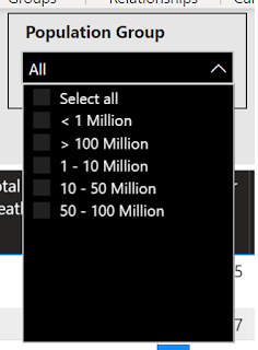
Once this column was created, I simply added it to the report as a slicer.
You will notice the drop down list for the slicer is not in the correct order. I would like to have the largest group "> 100 Million" listed last. This is because the field is sorted alphabetically and numerically, the symbols come before the numbers.
Step 4 - Create a sorting column
In order to fix the sorting of the slicer, I created another column where I replaced the text names of the groups with numbers.
Population Group # = if('Country Population'[Population] > 100000000,"5",
if('Country Population'[Population] > 50000000,"4",
if('Country Population'[Population] > 10000000,"3",
if('Country Population'[Population] > 1000000, "2", "1"))))
I was able to use the Population Group # as the "Sort by column" for the Population Group. Sort by column can be found on the Column tools menu on the ribbon bar.

With these two columns, I was able to quickly provide the additional information the user was looking for in a very easy, straightforward approach.
If you have any questions about my Covid 19 dashboard or about other Power BI topics, please do not hesitate to leave a comment.


Comments
Post a Comment